
magazine
analyses
Magazine adverts are an element of promotion for an artist to reach their target audience. Magazines are an easy accessible source hence why it isn't uncommon to see musicians promoting their upcoming albums/tours. It is important for artists to have magazine adverts that stand out and hold key information.

MUMFORD & SONS//SIGH NO MORE
Mumford & Sons’ magazine advert for “Sigh No More” consists of a pure black background that contrasts with the light within the images of them. It also highlights the images, making the audience focus on the band members, making them the main focal point on the poster. The images have a soft sepia tone to them, making them appear with a yellow-ish tint but also giving them a retro image. It makes the poster look vintage and includes country elements. They are wearing smart but vintage clothing that ties in with the latest indie conventions of the shabby-chic look. Each band member is holding or positioned with the instrument that they play, making them look authentic and raw, focusing more on the music than the publicity.
Each band member is shot in the same mid-shot, that cuts off in similar places. This shows that all the band members are equal to one another, they don’t focus on having a front man, as each member is as important as the other. The use of the mid shot allows us to establish the instruments that they are playing as well as identify each different member of the band.
For font that have used a traditional, clean looking serif font. It gives them a classy image compared to other magazine adverts I have analysed where they have used bold sans serif font. It presents the band as being serious about their music but also their image and that they feel that the album needs more of a classy, clean and vintage representation.
The layout of the magazine advert replicates an old photo book, giving it that vintage effect that they seem to have been aiming for. It also looks clean and modern, which appeals to a younger target audience as they become drawn to it due to the aesthetic.
FEEDER//RENEGADES
Feeder’s poster for their album “Renegades” consists of natural lighting, however the image has a soft dull cyan tint to it, giving it more of an old school punk vibe. The girl on the front cover is sexualized in the sense that she is naked but at the same time she is covered by herself. By covering her face, it means that audience can’t be appealed to her beauty as they only things we can see are her eyes and lips. The use of the thick winged eyeliner represented femininity whereas the bold red lipstick represents the danger and rebellion. The balaclava also tries in with rebellion as in the media it is seen as common thing that criminals use during illegal pursuits. The prop of the skateboard brings in a younger target audience as it’s skateboarding is typically linked in with American teenage boys.
The font that they have used is a bold sans serif font, the band and album cover’s name if in a deep red as well as the “out now” this attracts the audience eye as it stands out on the background. “The new album” in white is harder to see on the background but is still readable. They have put the word “Renegades” on the poster twice, one along the top and then another down the woman’s body. By placing it down her body it sexualises her due to us as the audience then having to focus on her body to read what it says. By placing it on the poster twice it shows that the band care more about the promotion of the album than the promotion for themselves which is conventional for the rock genre. The layout of the poster throws the audience off a bit as they haven’t followed the z – line technique. All the typography is placed in the top left hand corner and then the image is located in the mid/bottom right. This means that the audience then focus more on the poster because at first glance it confuses their natural line of sight.

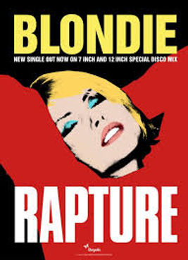
BLONDIE//RAPTURE


COLDPLAY//MYLO XYLOTO
Coldplay’s poster for “Mylo Xyloto” is constant with their album cover, creating continuity throughout the promotion of it. The bright and vibrant background attracts that audience’s attentions and would stand out more on a stand than a simple poster. The colour connote positivity and happiness through the vibrancy of them. Their background has a graffiti element to it which is usually linked with the urban-ness of the streets. It also is commonly seen as a rebellious thing but due to how colour and vibrant theirs is, it looks more as an artistic outlet for someone who was possibly feeling isolated and needing to express themselves. The colours merge in the centre which is a typical thing that Coldplay do on many of their albums, it because a symbolic reference to them but also create a galaxy/space illusion. The typography is a little hard to read due to the thinness of the line but it shows the band’s name along the top in a medium sized font and then underneath the album’s name in a large font that takes up most of the advert. This shows that they are a band that care more about the promotion of their music than the promotion of themselves.


GREEN DAY//21ST CENTURY BREAKDOWN


